One Dev is a security app that detects and protects users from DNS redirection attacks in real time. When users connect to public Wi-Fi or unsafe networks, attackers may change DNS settings and redirect users from the correct website to a malicious page. This may cause personal data leaks or account theft.One Dev 是一款即時偵測並防護網路重定向攻擊的資安工具 App。 當使用者連上公共 Wi-Fi 或不安全網路時,駭客可能透過竄改 DNS 設定,將原本正確的網站導向惡意頁面,造成個資外洩或帳號被盜。

During daily internet use, if DNS settings are changed by attackers, users may be redirected to malicious websites without knowing it. This can lead to personal data leaks, stolen accounts, or malware on devices.However, most users do not have a network security background and may not notice these risks.To solve this problem, the team proposed a DNS security tool focused on preventive protection. The goal is to provide a stable and safe connection before users enter any website.After the idea was confirmed, the PDM team and the O4ONE PO started technical research and system planning. One Dev was then developed as the solution.
在客戶(使用者)日常上網的過程中,若 DNS 設定遭到竄改,可能會在不知情的情況下被重新導向至惡意網站,進而造成個資外洩、帳號被盜用或裝置感染惡意程式。然而,多數一般客戶(使用者)並不具備網路安全背景,也難以察覺這類風險是否正在發生。因此,團隊提出一套以「預防性防護」為核心的 DNS 安全工具構想,希望在客戶(使用者)進入任何網站前,先提供一層穩定且可靠的連線保護機制。確認執行時,由 PDM 團隊與 O4ONE PO 隨即展開相關技術研究與系統架構規劃,並發展出 One Dev 作為解決方案。
In this project, I helped design the app interface and interaction flow, and created full UI mockups for development.I also prepared design handoff documents for the engineering team, including screen guidelines, component notes, and interaction descriptions to ensure the design could be implemented correctly.During development, I worked closely with the PO and both frontend and backend engineers to clarify requirements, adjust user flows, and refine visual details. I also followed up during implementation to maintain visual quality and user experience.
在本專案中,我負責協助完成 App 的介面設計與互動流程規劃,並產出完整的 UI Mockup,作為開發實作的依據。同時整理並提供給工程團隊所需的設計交付文件,包含畫面規範、元件說明與互動備註,確保設計意圖能被正確落實。在開發過程中,我與 PO 與前後端工程師密切溝通,協助釐清需求、調整使用流程與視覺呈現,並在實作階段持續追蹤畫面品質與體驗一致性,確保產品在時程與品質之間取得平衡。
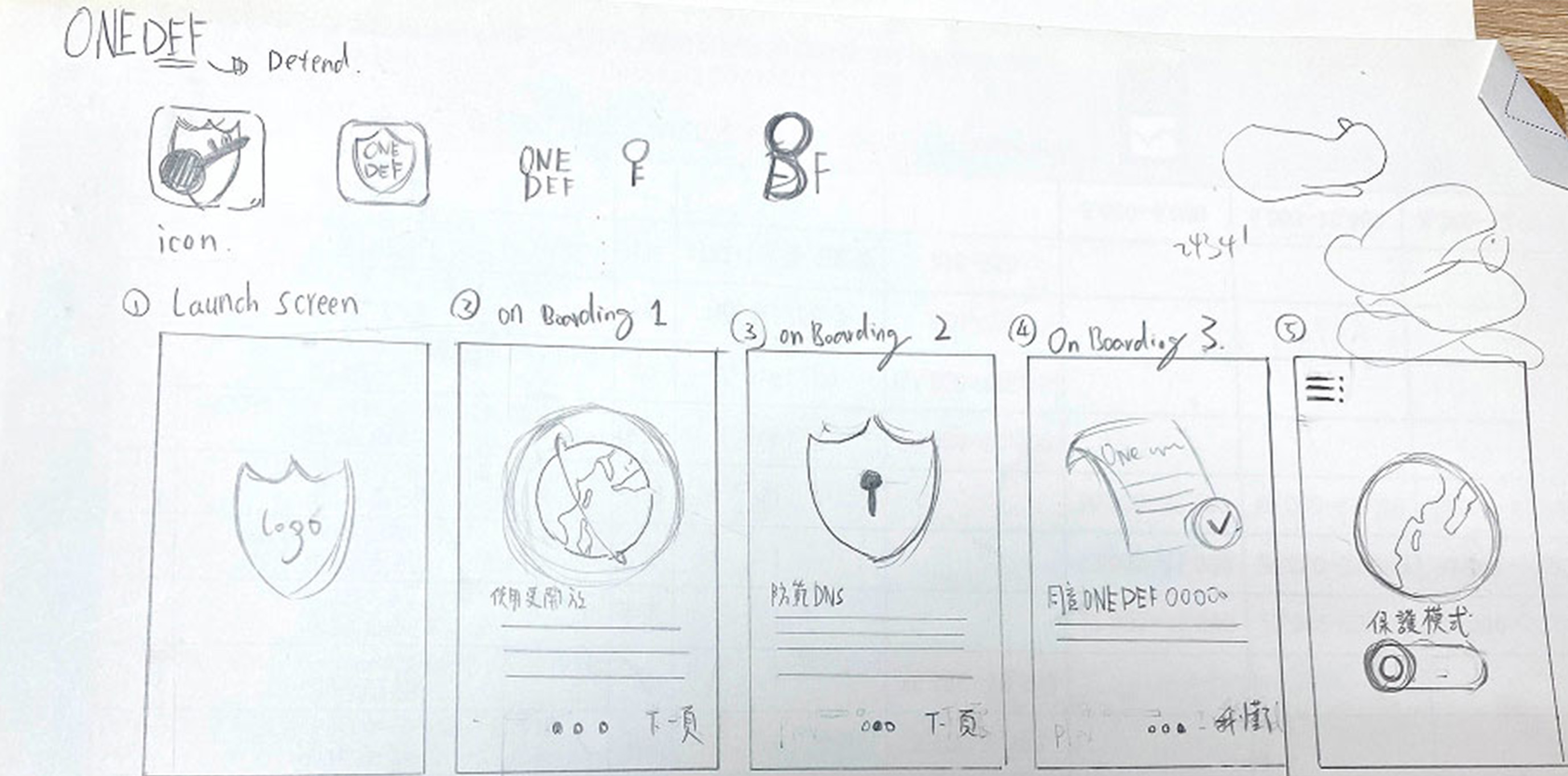
The information architecture and wireframes were planned and provided by the PDM team using Axure.Based on this structure, I created and completed the wireframes and discussed user flow logic and usability details with the PO and engineers to make sure the design could be implemented smoothly.
資訊架構與 Wireframe 由 PDM 團隊使用 Axure 規劃並提供。我依此作為設計基礎,繪製並補齊相關結構的 Wireframe,並在設計過程中與 PO 及工程團隊共同討論流程合理性與使用體驗細節,確保設計能順利落地。


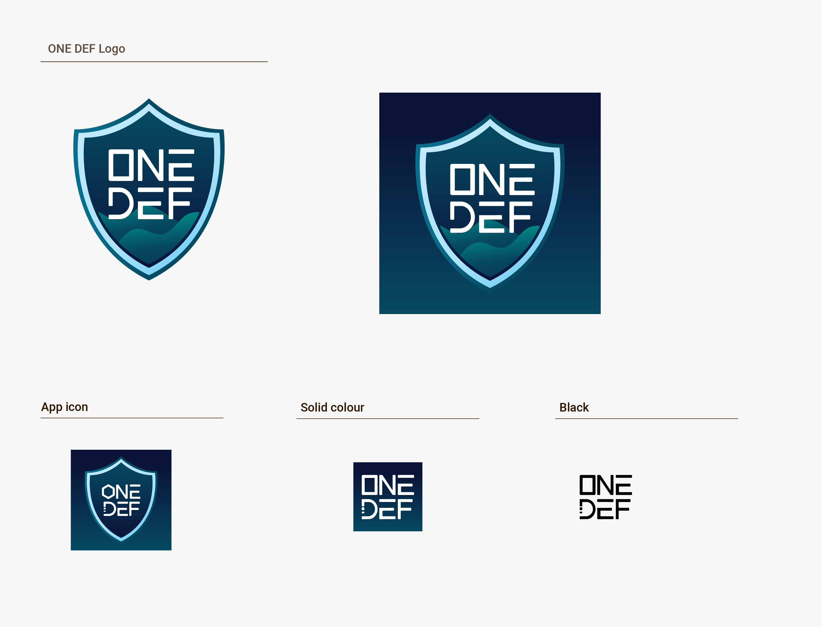
The shield represents protection and security for users’ internet connections. In the digital world, many risks are invisible. The brand uses a clear and simple symbol to show safety, reliability, and trust.The outer shape of the shield has sharp and stable lines, representing strong system protection. Inside the shield, soft curves and gradients create a friendly and approachable feeling for users.The visual style balances technology and trust, showing professional security technology while still feeling easy and friendly for everyday users.
作為核心視覺意象,象徵對客戶(使用者)網路連線的守護與防護。在數位環境中,風險往往是看不見的,品牌希望透過直覺且明確的視覺符號,傳達「安全、可靠、可被信任」的第一印象。護盾外框採用銳利而穩定的輪廓,代表系統層級的防護結構;內部則以柔和曲線與層次漸層呈現,象徵在強固防護之下,仍保有對一般使用者友善且不具壓力的使用體驗。整體視覺風格以「科技感 × 安心感」為核心平衡點:既要傳達專業的資安技術實力,也要避免給使用者過於冰冷或距離感過重的印象,讓 One Dev 成為一個安全工具。
The main colors are dark blue and blue-green tones.These colors represent stability, professionalism, and trust in technology, which also match the product’s network security positioning..
主色系以深藍與藍綠色系深藍與藍綠色系為基調,傳達穩定、專業與科技信任感,同時也呼應網路安全與系統防護的產品定位。
Dark Blue:Represents stability, reliability, and strong security.
深藍色:代表穩定、可靠與企業級安全感,建立使用者對系統的信任基礎
Blue-Green Gradient:Represents data flow and real-time protection, giving a modern technology feeling.
藍綠漸層:象徵資料流動與即時防護,讓技術形象更具現代感與科技感
Bright Border:Strengthens the shield shape so the protection symbol can be clearly recognized in different sizes and contexts.
亮色邊框:強化護盾輪廓,讓「防護」的意象在各種尺寸與使用情境下都能清楚辨識在 App Icon 與單色版本中,則保留品牌的核心結構與識別特徵,確保在不同背景與使用情境下,仍能維持一致且清楚的品牌辨識度。
Since this is a one-time project delivery, the app will be maintained by the support team after completion. Therefore, the design system focuses on clarity and easy reuse, ensuring visual consistency during future maintenance.
本專案提供一套輕量化設計系統,包含色彩與基礎元件規範。由於專案為一次性交付,App 完成後將轉由客服單位維護,因此設計系統著重於易理解與易延用,確保後續維護仍能維持視覺一致性。

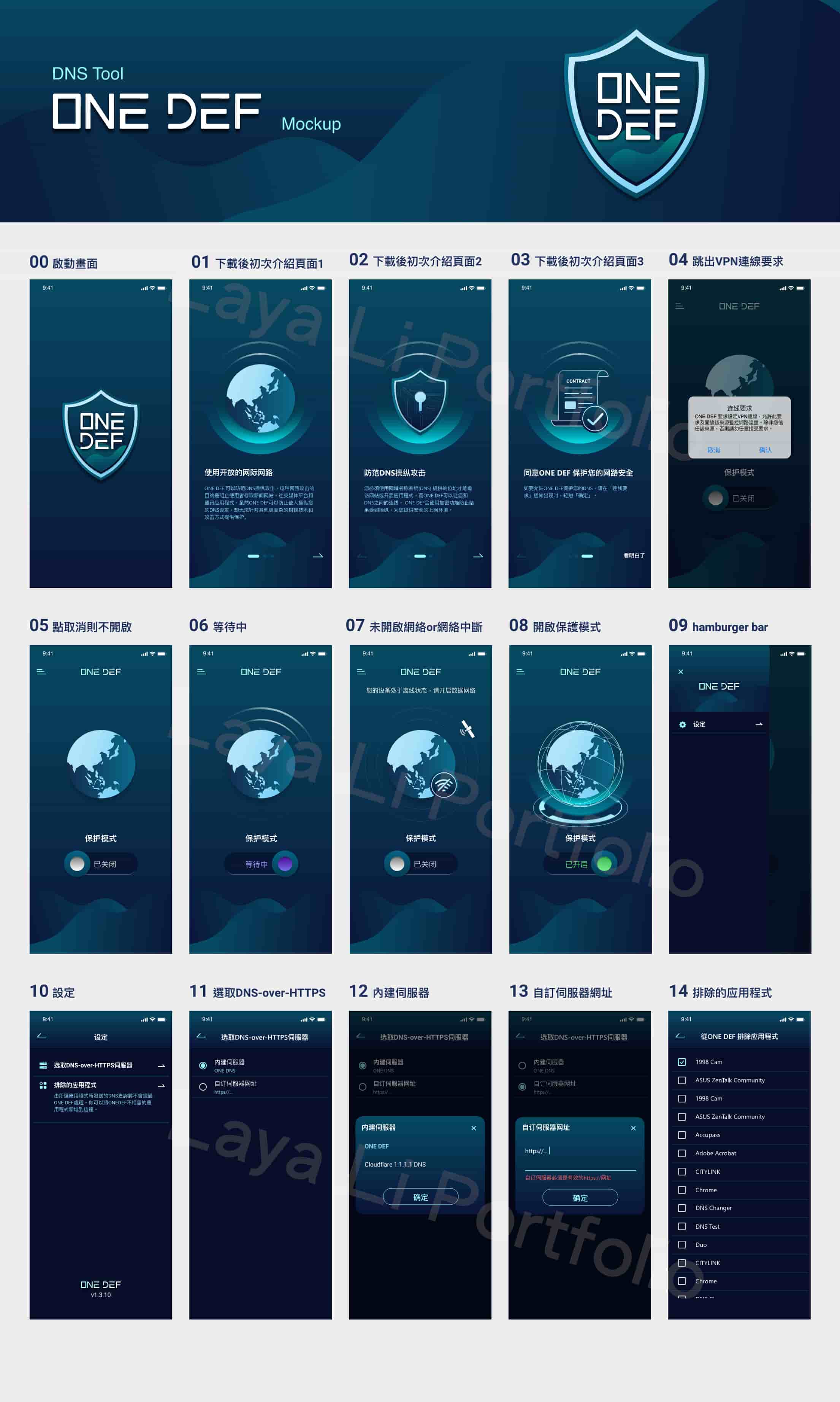
Through mockups, the design shows how the app looks in different usage scenarios, including layout structure, information hierarchy, and key interactions. These visuals help present the design decisions and user experience.
透過 Mockup,呈現設計在不同使用情境下的實際樣貌,包含版面配置、資訊層級與關鍵互動,作為設計決策與體驗驗證的視覺成果。



The app engineers informed us that the app did not support Lottie (JSON) files.Therefore, motion assets were created in Adobe XD, exported as GIF files, and delivered together with animation documentation for engineers to implement.
由於開發 App 工程師告知 App 尚未支援 Lottie(JSON)檔案,動態圖檔需透過 Gif 來提供,因此使用 Adobe XD 來完成動態圖後,轉為 Gif 檔案,並提供動畫交付的說明文件給 App 工程師來進行。


This was my first time to finish an app project by myself. I started from understanding the product structure and used prototype videos to discuss with the PDM, PO, and developers. In the end, I turned the needs into workable UI mockups.It was also my first time to design interaction animations. I worked on the animation design, exported the assets, and prepared files for engineers. I finished all the screens and user flows in two weeks.After the project was done, I helped organize the design files and delivered them to the support team for later use.
這是我第一次獨立完成一個 App 專案,從理解產品架構開始,透過 Prototype 操作影片與 PDM、PO 及開發團隊反覆討論,最終將需求完整轉化為可實作的 UI Mockup。同時也是我第一次負責繪製操作動畫,從動畫設計、輸出素材到提供工程師使用檔案,並在兩週內完成產品所需的畫面與流程設計交付。在專案完成後,我也協助整理設計檔案並交付給客服單位作為後續維護依據。
About one month later, the PO gave some feedback, but most changes were for engineering. The UI design did not need changes, which showed the design fit the product needs.This project gave me full experience from understanding needs, working with other teams, designing motion, to final delivery. I learned that design is not only about making screens, but also about making sure the product can be built and delivered well.
約交付的一個月後,PO 回饋部分調整需求,但修改內容主要集中在工程實作層面,UI 設計本身並未需要調整,代表本次設計在可用性與一致性上符合產品需求。這個專案讓我累積了從需求理解、跨部門溝通、動態設計到實際交付的完整經驗,也更清楚體會到設計在產品落地過程中所扮演的角色,不只是產出畫面,而是確保需求能被正確實現並順利交付。

